Visual content is vital for any business. It helps attract and engage your audience on social media and on your website. So here are my 10 tips for creating great visuals!
1. Make visuals part of your marketing strategy
Your visual strategy must be included in your marketing plan. You can’t have effective visual content without having a clear direction for your marketing.
Your visual strategy should include:
- Audience Research. Think about what type of visual content your audience is going to like
- Create a mood board. Add content, colour palettes and other visual elements that will help shape your direction.
- Platform. Consider how you should adapt your strategy for each social media platform and your website.
- Timing. Are you going to include more visuals around national days or certain holidays? You can plan these in advance and schedule them.
2. Get to know the creative basics
We’re not all graphic designers, so here are some basic practices for creating visuals:
- Have a clear subject. You never want an image to look too busy because it usually distracts from your point.
- Remember the rule of thirds. It’s best not to centre your subject perfectly (with some exceptions though).
- Use natural light. If you’re going to be taking your own photos always have natural lighting. If you’re using an iPhone and there’s very little natural light use portrait mode and choose the natural light setting, it really works.
- Choose complementary colours. Your logo colours are the ideal place to start because they already work well together. If you want to branch out and incorporate other colours then try different colour combinations with your logo. Just remember, don’t go overboard you only really need two or three colours.
- Keep it simple. You really don’t need to go over the top when it comes to photos or creating your own graphics. Make sure your visual is easy to understand.
- Don’t over-edit. I would suggest staying away from any filters and editing features unless you’re a professional photographer, you can probably do more harm than good.
3. Use free tools
You don’t have to be skilled in Photoshop or Illustrator to create some amazing designs, make use of free tools like Canva. It’s free, easy to use and you can create your own really cool graphics for social media and your website. Just a quick tip, when creating your images, remember whitespace is your friend; you don’t need to fill every inch of space with text or images.
4. Image Sizes
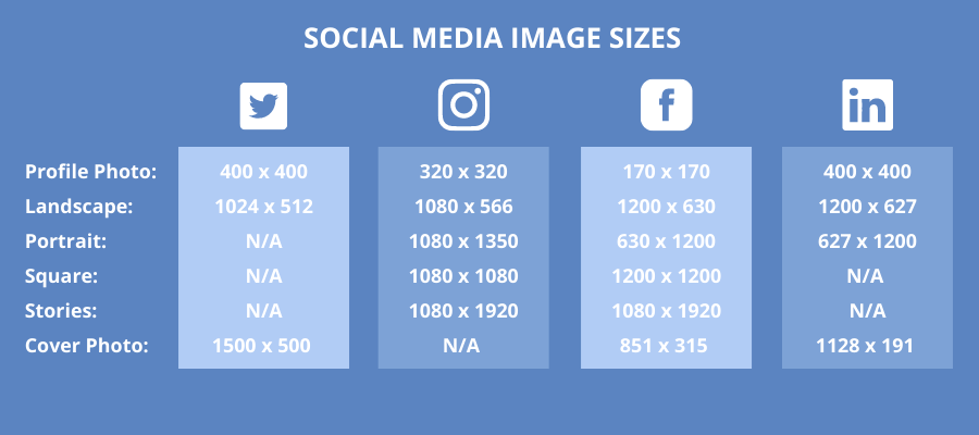
One of the biggest things that you can do wrong when sharing visuals is using the incorrect size. If you’re posting visual content to a social media site that’s the wrong size or low resolution, that image will end up stretched, cropped or completely out of proportion. Here are the exact sizes you need for each social media platform.

5. Be tasteful with text
If you plan to create quote images or stylised typography, less is always more. Text in visuals should always be bold, legible, straightforward and concise. There needs to be enough contrast between the text and background so that it’s readable.
Just a few tips:
- Always choose your font wisely, if you mix fonts pair a serif with a sans serif,
- Avoid difficult to read colour combinations like blue and yellow or red and green
- Keep the line length short.
- Triple check spelling and grammar
6. Add your logo where appropriate
If you’re posting your visuals on social media, it may be a good idea to add your logo. If you decide to do this there are a few things to remember.
- Place a small logo in the corner of the visual
- If the colour clashes then opt for greyscale or a neutral version.
- Not every visual is going to need your logo, for example, if the logo is your Twitter avatar then you don’t need one in your header image.
7. Include alt-text descriptions
Making your visual content accessible to as many people as possible is so important. Alt-text allows the visually impaired to appreciate images. You can add alt-text descriptions on your website as well as on Twitter, Facebook and Instagram. Make sure you add captions to any videos you post on social media. Not only is this crucial for hearing-impaired viewers, but it also helps in office environments where perhaps you can’t have the sound on.
8. Optimise for SEO
Not only are your visuals vital in engaging users but they’re just as important in terms of SEO (search engine optimisation). Here are some things to keep in mind:
- Choose the right file name, it needs to include relevant descriptive keywords
- Make sure you use hyphens when creating the file name so search engines can ‘see’ the words
- Choose the right format – use JPEG for larger photos, PNG for a transparent background and SVG for logos and icons
- Use an image that matches your text
- Reduce the file size for faster loading on your website
9. Add animation
In a world of visuals, a little animation can go a long way to helping your content stand out. GIFs and videos are a great way to add movement and narrative to your visuals.


